One of the fun parts of the self-published author route is getting to learn and pick up skills that I may never have considered before. The first few goes were definitely frustrating in terms of formatting my e-book and my print book. In following along the formatting style guide for the Smashwords distribution site--it all felt easy. Familiar.
I’m still not super good in following all the bells and whistles possible, but I’ve been using the free version of Canva to make my book covers ever since my first attempt at Moonshine (may it rest in peace) was too low resolution to use.
I’m still not super good in following all the bells and whistles possible, but I’ve been using the free version of Canva to make my book covers ever since my first attempt at Moonshine (may it rest in peace) was too low resolution to use.
Canva works similarly to a lot of the design platforms I’ve experienced--you build things using the concept of layers. You can make some things transparent, overlay colors, put on text boxes. It can get frustrating, to me, in that selecting the item or layer you’re working on isn’t always super intuitive. A lot of times my covers get done when I’ve thrown my hands up in the air one too many times. But Canva is helpful in that I can create covers I’m proud of using images I’ve sourced. They may not have all the bells and whistles possible, but I’d like to think they get the job done. Plus it is actually really fun to source images and put them together in a way to convey a design or aesthetic about my book. I have covers for books that have yet to see the light of day because I found an image that worked so well with the plan. It really is fun to change font types, to change an image’s orientation on the page to look completely different.
Because I have book e-books and print books, I also need two different versions. For e-books in particular, while I tend to upload with color, I need to make sure it looks good in greyscale as not every e-reader converts. I had one of the first Nooks from Barnes and Noble forever and that was true for me. For the print brooks, it needs front cover, it needs the spine, it needs the back cover. All useful things and all things that require thinking through how the cover will look even as you design on one large rectangle. I always start with a standard size for the print cover (Amazon’s Create Space has a template as I’m sure do others). I always have to end up adjusting it though because the actual size needed will depend on the number of pages--so I always try to keep my spine style congruent with the front and back cover so that way I don’t have to do too much adjusting. If you want a very bold, very different spine, make sure you build in time for adjusting.
Building the cover does require images. If you’re looking to keep your price low (aka free) your best bet is to use images that you took yourself or created yourself or look for public domain pictures. I’m not an expert at copyright--so I try to make sure the site I’m on notes it as public domain and I also double check the year. The older the image the more likely it is to be in public domain.

My covers themselves have images from different places. Moonshine used a photograph I took in Ireland. Catspaw was from looking through photographs posted on Morguefile. Morguefile is a great site because it’s images that photographers have taken and then posted that are free for commercial use. I reached out to the photographer that posted the image I used in my basis for Catspaw and received permission to use it. Don’t Belong to No City had a much simpler search as maps often fall under federal agencies, many of whom also provide public domain images. The map I used was from the late 1880’s increasing the chances it would fall under public domain.
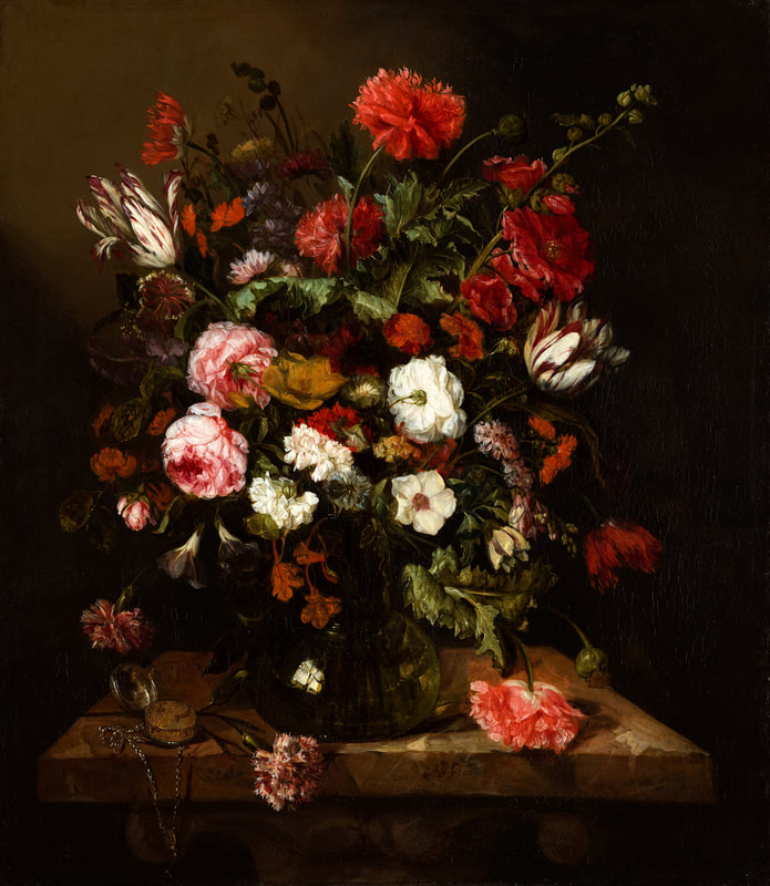
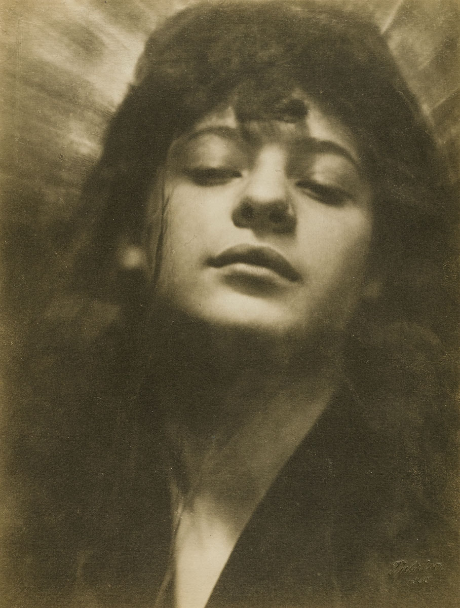
For Middle Ground, my next book, I wasn’t quite sure what I wanted the cover to be. I ended up using two images that are listed on public domain after searching Europeana. Europeana is a one-stop show to browse digital collections from libraries in the European Union. You can sort by types of permissions as well--which is really helpful.
Here are the two images I used to build my Middle Ground cover--and I also used the still life of flowers to create new blog headings to match:
 |  |
Quick tip! Always make sure to save the link of where you found the image along with the creator’s name in order to give proper credit. You can find that usually in the front or back matter of any books you look at including information on who designed the cover. My books tend to list that at the front cover.
Here are the full links for the two images used above:
https://sammlungonline.mkg-hamburg.de/de/object/Kopf+mit+Heiligenschein/AB1988.336/dc00029988
https://www.europeana.eu/en/item/2021672/resource_document_mauritshuis_548
Here are the full links for the two images used above:
https://sammlungonline.mkg-hamburg.de/de/object/Kopf+mit+Heiligenschein/AB1988.336/dc00029988
https://www.europeana.eu/en/item/2021672/resource_document_mauritshuis_548
 RSS Feed